
Psychedelics Design Releases Detailed Psychedelic Ecosystem Overview through Visualisation
Psychedelics Design releases a detailed overview of the psychedelic via visual colourwheel.
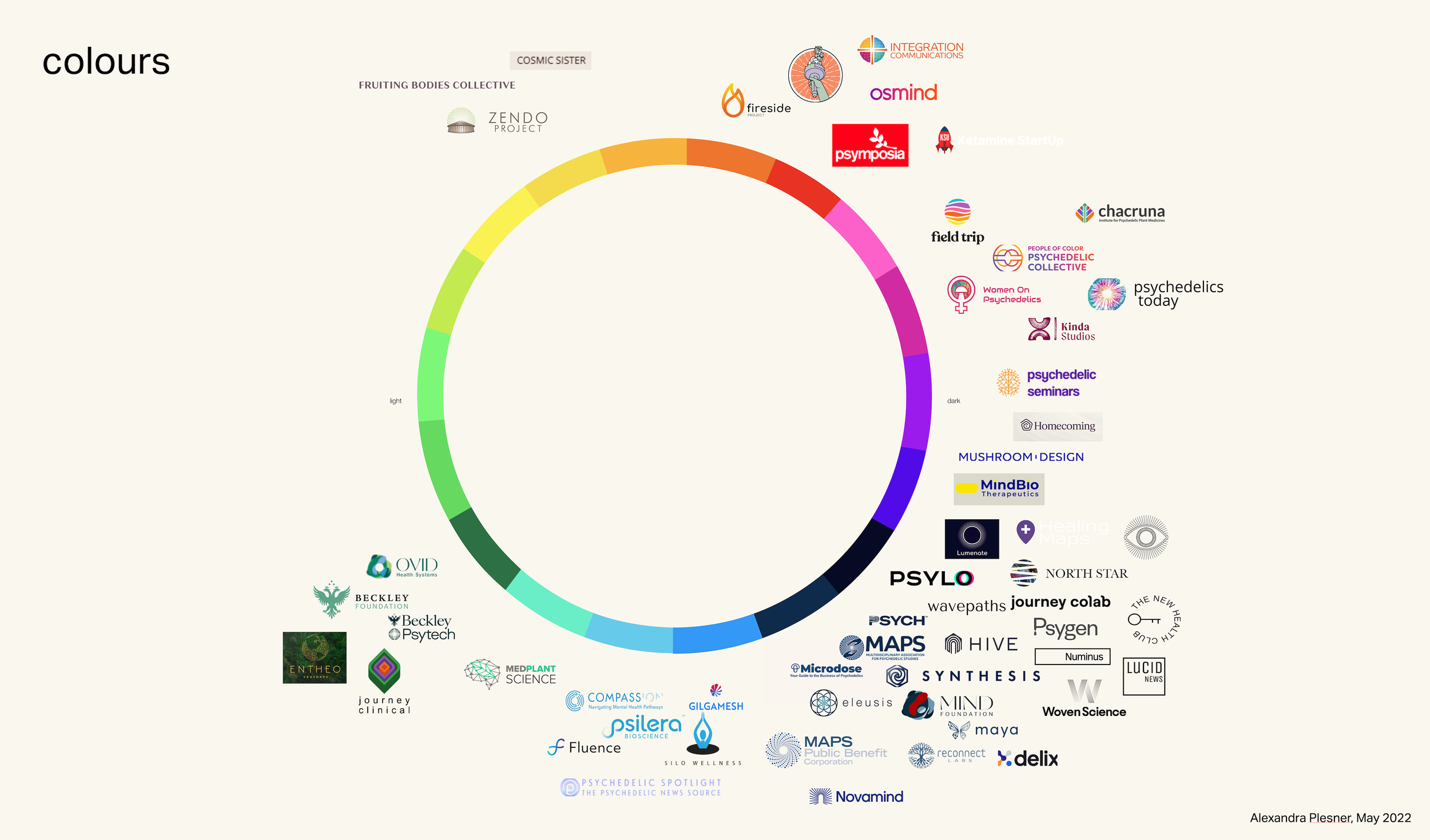
Since 2019 the psychedelic industry has seen an explosion of startups making an entrance. Some have a product, some don’t but have already secured funding. It is a rollercoaster. One thing which stands out from a visual perspective are brand identities crying for some narrative in an industry that has to treat visual presentation carefully. Ultimately, it is built around something very personal: mental health.
Form and function
Looking at the colour wheel and existing logos in the psychedelic landscape, we can see a clear tendency towards darker colours, mainly blue. We see everything but ‘funky’ typesetting and a little bit of ‘extra’ when it comes to slightly overloaded icons, images and symbols which will appear on websites and across marketing paraphernalia. When used correctly, they convey big ideas without using a single word. They are occasionally not supportive of the story a brand wants to convey, or even worse, adding confusion or taking away from their credibility.
As a designer, having a visual overview is crucial for navigating the ever-evolving landscape. We trust that this resource proves valuable. While the list provides an overview, please note that it may not encompass every business in the industry.
Update, April, 2023:
The overview is now accessible via an interactive representation through psychedelics.design
Update, December 15, 2023:
https://open.substack.com/pub/psychedelicsdesign/p/typography-and-branding-in-psychedelics?r=hh6t5&utm_campaign=post&utm_medium=web&showWelcomeOnShare=true